Tuesday 28 February 2012

Urban Design Theory - Image of the City

Extracted from The Image of the City - by Kevin LynchPublished 1960

The image of the City by Kevin Lynch is a classic text of urban design and planning.   Lynch says that the structure of a city exists as a physical reality and also in the minds of its inhabitants. This thesis of “imageability” launched another angle from which city planning could be researched and organized around.
Summary
Each individual holds a unique image of their city, a visual representation that guides through daily life and maps out meaning.  Researching a sample of these images and the values attached can help planners discern a “public image” of their city. Lynch says,  planners “should focus on structure and identity, and work toward enhancing the imageability of the city, thus helping citizens orient themselves within it.”


Research
To illustrate this, residents of Boston, Jersey City, and Los Angeles were extensively interviewed about the images they carried of their own cities.

Boston scored high on identity, and its structure was understood by most of its residents – however, they were confused residents with its path system. With no basis order.
Jersey City lacked both a distinctive identity and clear structure – except for the ‘awe-inspiring view of New York City in the distance.
Los Angeles was built according to a rational structure, but lacked the kind of localised identity necessary to navigate through it.
The cities varied widely in how the image was situated in the passage of time. The Boston interviews were full of references to age contrast: ‘the new’ Artery cutting through the ‘old’ market district. In Los Angeles there was an impression that the fluidity of the environment and the absence of physical elements which anchor to the past are both exciting and disturbing. Many descriptions of the scene by residents, young and old, were accompanied by the ghosts of what used to be there.

The City Image and its Elements
People can mentally adapt to any situation, but there are design strategies that can make urban orientation easier.   Lynch identified a number  interconnected design elements: paths, edges, districts, nodes, and landmarks.

Paths are the transportation routes of the city and are the most common points from which the city is experienced. They can be made distinct and memorable through variation in design and natural setting. To avoid confusion, there ought to be an obvious hierarchy of streets, indicating which carry a higher volume. Each street need not be absolutely straight, but it ought to travel in one general direction and have a directional gradient to communicate where on the line the traveller is. Paths should have well-defined origins and destinations as well as landmarks along the way.

Edges provide a spatially distinct constitution to elements of the city. The more visually obvious they are, like a waterfront or park side, the better. Edges can be strong, but planners must ensure they are are still penetrable enough to allow connections across them.

Districts are relatively large areas that have enough identity to be named. Each district should be set apart from others through thematic, visual clues. Districts often become defined in terms of class or special use as well. Some districts are introverted, with sharp boundaries and an exclusive association, while others are extroverted, tied more closely to the whole pattern of the city.

Nodes are precise locations that require extra attention from the observer, usually junctions along a network of paths or transit stations. They should be limited to a reasonable amount and made distinct through edges and landmarks. A landmark is anything that stands out that can help an observer orient himself. It could be lavish and visually appealing, or it could simply be a foreground that contrasts sharply with the background.

These clues for urban design can be summarised in another way. These are the categories of direct interest in design, since they describe qualities that a designer may operate upon:
Singularity.  Sharp contrasts of boundary, surface, form, intensity, complexity, size, use spatial location.
Form Simplicity. Forms should be easily conceivable geometric shapes.
Continuity. Continuance of edge of surface – ie a cluster of buildings, repetition of rhythmic interval (a street corner), harmony of surface( ie. common building materials).
Dominance. Some elements stand out from the others.
Clarity of Joint. Emphasize strategic intersections and boundaries – ie. a major intersection or sea-front.
Directional differentiation. Asymmetry, gradients and radial references -  can help the observer detect direction.
Visual Scope. Points at which the larger picture can be taken in.
Motion Awareness. Make the traveller visually aware of his own actual or potential motion.
Time Series. Designing “melodies” in a series that is experienced over time i.e. a casual sequence of detailed landmarks.
Names and meanings. Non-physical attributes that enhance design features. Meanings and associations.


All the above qualities do not work in isolation. Where one quality is present alone (as in continuity of building material with no other common feature), or where qualities are in conflict (as in two areas of common building type but of different function) – the total effect would be weak. Or would require effort to identify and structure.

A certain amount of repetition, redundancy and reinforcement seems to be necessary. Thus a region would be unmistakable which had simple forms, a continuity of building type and use and was singular in the city, sharply bounded, clearly jointed to a neighbouring region and visually concave.
The designer should create a city which is richly provided with paths, edges, landmarks, nodes and districts.  The city form should induce the citizen to explore and create as well as find the most efficient route from place to place.

Citizens can learn how to perceive their city as an animated museum of our society  and its hopes.

Monday 27 February 2012

Sketch model

Here is my sketch model - showing the area between Hungerford Bridge and Blackfriars.


The little circles in the river depict our 'floating' pocket parks - as illustrated by Valentinos.
The circles coloured red are floating fire beacons - lit to mark special occasions and festivals.

The yellow section is the beach.

Sue

William H. Whyte's Design Theory

William H. Whyte’s criteria for a successful urban space:
 
Sittable space
  • Quantity, variety & flexibility are key
  • Integral seating is important, people will happily sit on ledges, steps, walls, sculptures, planter edges, fountain edges, etc
  • Opportunities should be available in both sun and shade
  • Circulation & seating are complementary – people often prefer to sit somewhere along their chosen route, not in a zoned seating area
  • Although weather-dependent & generally less comfortable, lawns provide additional seating
  • Moveable chairs are preferable to fixed benches for groups to communicate
  • Corners of steps can enable 45° angle spaces for groups (3+ people) to sit & communicate
  • Benches that are designed to be sat on from two sides should 2 backsides deep to allow for physical and psychological comfort
“The human backside is a dimension architects seem to have forgotten.” William H. Whyte
 
   “People tend to sit most where there are places to sit.” William H. Whyte
 
 
Streets & Plazas
  • Human scale
  • Ideally, not elevated or sunken – no greater than 1m change in level if unavoidable
  • Doors & windows should be included, blank walls are hostile
  • Shops, cafés, etc should be built flush with the pavement
  • Corners & junctions are popular areas for chance encounters, planned meetings & for observing others
  • The edges or fringes of plazas tend to be preferred, central open space is less used through feelings of exposure & high visibility (the amphitheatre effect) and often lack of sittable spaces
  • Access points are often busy and provide secondary use through meeting points & visual access to the main site
 
 
Light
  • Direct or deflected daylight (via buildings or water) is essential to the feel of a place
  • Sun traps vary in appeal according to seasonal temperature!
 
 
Food
  • Easy access via street vendors & outdoor cafés advertises availability
  • Circulation & tables should be close enough to encourage social interaction, whilst still enabling ease of access & comfort
  • Waste bins should be in plentiful supply, emptied regularly & well sited. Ease of use & social pressure will assist in keeping the area clean & tidy

“Food attracts people, who attract more people.” William H. Whyte
 
 
Water
  • Accessibility is important – people should be able to see, touch, taste, hear & smell water
  • Drinking fountains are too rare but an important resource
  • The white noise of moving water, although often loud, is perceived as pleasanter than traffic noise, which it can mask
 
 
Trees
  • Provide shade – welcome in summer
  • Large trees create a sense of domain
  • Improve the microclimate through transpiration & wind protection
  • Help mitigate solar glare & urban heat island effects
 
 
Triangulation
  • Sociability: crowds attract people & encourage social interaction
  • The ‘shill effect’ – e.g. if you stand and point at a distant object in a public place, eventually other people will join you to see what you are pointing at.
  • Shill [OED definition]: “Person employed to decoy or entice others”
 
“What attracts people most, it would appear, is other people.” William H. Whyte


“It is difficult to design a space that will not attract people. What is remarkable is how often this has been accomplished.” William H. Whyte

Friday 24 February 2012

Sections not to scale/ just an idea


DRAFT SECTIONS

Hey guys, these are the draft sections.
Hope they do make sense otherwise let me know.


Structures moving up and down depend on tide( island gardens)


Paving extension(moveable) and garden island(moveable) up and down depend on tide


Wavy extension with some planting(walkable only if tide is low)


 Garden islands( moveable)

Friday 10 February 2012

precedents-elevated greenways


...some pictures of the High Line in New York City as a precedent for elevated greenways...

Thursday 9 February 2012

Great walks around London: the South Bank

Dear All,
I found this link - which describes our route from Westminster to London Bridge, with a short history and description about the various places en-route.


Great walks around London: the South Bank

Slogan

To go with Swavka's concept model and following last week's brainstorm - to remind ourselves here is the slogan we came up with....


Southbank... building cultural ebb and eco flow.

Wednesday 8 February 2012

my model

as I said I tried to do a quick conceptual model - based on the precedence of the Green Roof Art School in Singapore....
probably a lot to work on but at least there is a start...


precedence

and Vanarassi - living river

precedence


hej! I found what that is! Green Roof Art School in Singapore. have a look inside too.
doesn't remind you of Waterloo station, you reckon?

Eyesoreit

BAP and native species


..... and my bit about Biodiversity Action Plan and native species. I have the whole list of native species, just tried to illustrate the representatives. But because it covers the area up to 10 km (it's not very precise and our site is ....a bit smaller) I think we need to combine with some geology to exclude some of the species. but definetely marshy anad mrginal plants belong to the area


I have managed to upload my eyesoreit.... finally worked it out. (I hope)

Land Use

Finaly finished the Land Use Map and it is all uploaded on Dropbox...

Paris plage


Eyesoreit

Precedents

My subject was Toronto Waterfront Wavedeck, but Isabel uploaded some pictures about it...

So what about Cork docklands public realm competition in Ireland? It is been designed by Martha Schwartz.


And also Doha Corniche Masterplan Competition, again from Martha Schwartz.


I think there are some good ideas about how to extend the pavement to the river and make people interact with the water.


Brilliant colours by the way..

Eyesoreit

If we still need to choose a group 'eyesoreit' then I'm voting for Sue's ...

Precedents: Planters

To provide a loose constraint / grid for aquatic plants, what about a submersible version of Gray Organschi Architects' latticed 'urban porch' for Mill River Park in Conneticut?  It already has an organic, wave-like flow - suitable for a tidal river.


Waterfront Access

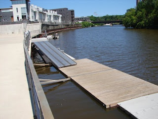
Ok, whilst not my topic I discovered these images and wondered what your views are about playing with different levels and forms for bank-shore access?  The big 'waves' would look great near the graffiti area ...


Toronto Waterfront Wavedeck


Warning!  The following images are hideous


.... but offer ideas about extending down / onto the river - direction? materials? fixed? floating?

And going off on a slight tangent ...

Not what we discussed but how fabulous is this artificial island, originally conceived as a flood defence?


Donauinsel, Vienna.  Landscape design by Wilfried Kirchner & Maja Kirchner

Precedents: Planted Banks

Planted, terraced riverbank courtesy of West 8, could be used for creating softer transitions between land and river along creeks and inlets.


Ile Saint-Denis quartier écologique.

Precedents: Planting Design

Thinking about how to reintroduce aquatic vegetation along the South Bank, without it being perceived as 'scruffy' or looking like a token gesture, I came across these images of the Jardin Botaniqué de Bordeaux designed by Catherine Mosbach.


Although these forms may be too geometrically bold, the idea of plant filled lagoons of varying size (and shape?) seemed quite interesting.